Supported component entrypoint
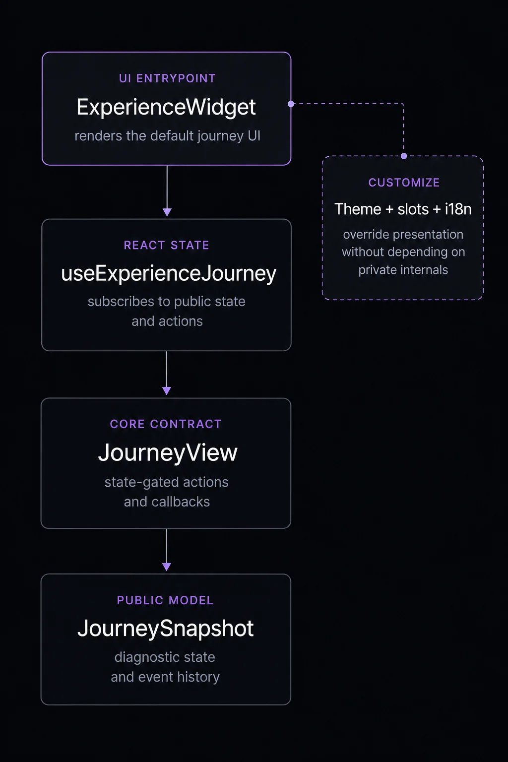
ExperienceWidget is the primary UI entrypoint for queue, draw, auction, timed release, and appointment sequences, plus the gated, granted, ended, and error stages. It also renders the waitlist attachment that can appear on a scheduled sequence (consumers join or leave via the scheduled sequence’s waitlist attachment, not a standalone waitlist mechanism).
Do not start new integrations with standalone distribution widgets. The supported model is journey-first:
- Use
ExperienceWidgetfor drop-in UI. - Use slots for targeted replacement.
- Use a render prop or
useExperienceJourneyfor full custom UI.
Customization ladder
| Level | Use for | API |
|---|---|---|
| Theme | Brand colors, typography, and imagery. | theme, ThemeProvider |
| Variant | Packaged presentation style. | variant |
| i18n | Button labels, messages, and locale. | locale, translations, I18nProvider |
| Slots | Replace specific journey states while keeping default behavior. | slots |
| Render prop | Replace the whole widget UI for one instance. | children |
| Hook | Build your own component tree. | useExperienceJourney |