

Before you start
- Any team member can edit your brand and per-experience colors—admin permissions aren’t required.
- The Brand editor is available on every plan. On Starter, selecting Design Studio opens the Brand editor directly; reusable templates require Growth or above. See Templates and widget designs and Plans and what they unlock.
- Have your logo ready in JPG, PNG, GIF, or WebP format.
Set up your brand
1
Open the Brand editor
Select Design Studio in the sidebar, then select Edit brand on the brand card at the top. On Starter, Design Studio takes you straight to the Brand editor.
2
Upload your logo
Under Identity, upload a Logo (displayed in headers at 200×80px). You can remove or replace it from the same field at any time.
The Header Image field under Identity is stored with your brand, but isn’t currently displayed on widgets, hosted pages, or emails.
3
Pick your colors
Under Colors, set any of the six color roles: Primary, Secondary, Background, Surface, Text, and Muted. Any role you leave unset shows From the design and falls back to your widget design’s color (previewed with the built-in Kinetic style). Select Reset to design to hand a role back to the design.
4
Choose your fonts
Under Typography, select a Body Font and Heading Font from the font list.
- Save anyway: Applies your change and won’t prompt again during your current visit.
- Cancel: Stops the save and displays Save failed. A newly uploaded logo is removed from the panel; color or font edits stay in the panel until you change them back or reload the page.
Hosted pages pick up brand changes within about a minute, and embedded widgets update even faster. Emails can take slightly longer, and emails already queued to send keep the brand they were generated with.
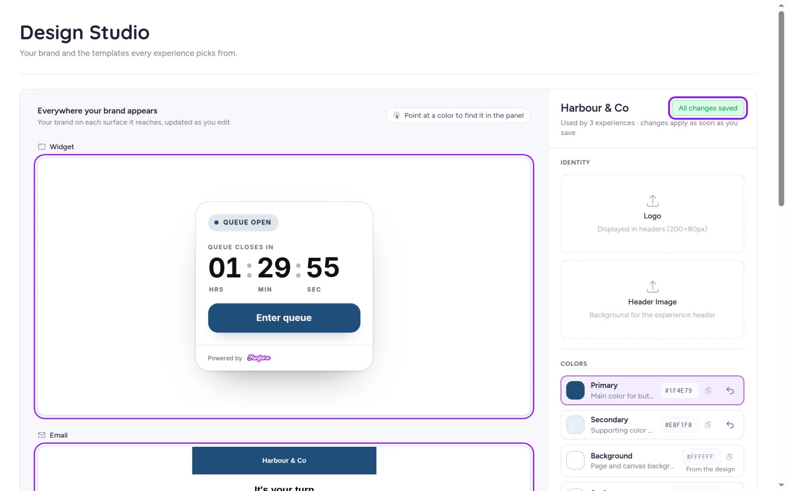
Brand changes auto-save—wait for All changes saved at the top of the panel before leaving.
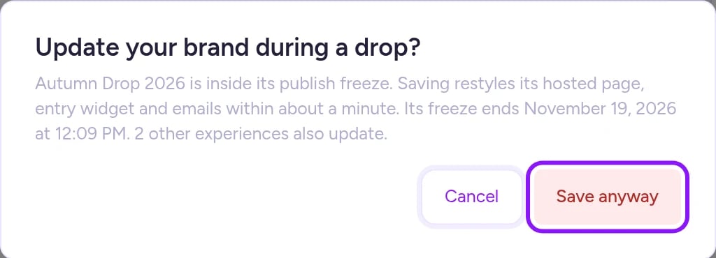
When an experience is inside its publish freeze, Fanfare asks you to confirm before saving brand changes.
Brand settings reference
On Fanfare-hosted pages, your brand fonts style the embedded entry widget (unless the page sets its own fonts), while the surrounding page keeps its template’s fonts. On your own website, load your brand fonts on the page or enable SDK font loading—see Run it on your own site and How fonts work.
Preview where your brand appears
The left side of the Brand editor renders live previews across three surfaces: Widget, Email, and Hosted page. Hover over any color row to highlight where that role lands on each surface (unused surfaces dim with a note), or hover and click directly on a preview surface to jump to its color role. Note that the Hosted page preview is illustrative—real hosted pages inherit only Primary as their page accent, while the embedded entry widget inherits your full brand.See which pages override your brand
Below the brand settings, the Where it’s used panel shows how many experiences use your brand and lists any published hosted page that sets its own colors or fonts (for example, “Sets Primary on its page”). Pages with custom overrides keep their own values even when you update your brand. Select any row to jump straight to that experience’s Design tab. If no pages override your brand, the panel displays “Every experience follows the brand.” See Build and publish the hosted page to adjust page-level styles.Override colors for a single experience
Give a collaboration, VIP launch, or seasonal release its own palette without changing your organization-wide brand or templates:- Go to Experiences, open the experience, and select Design.
- On the Experience colours card, set any of the six color roles. Unset roles display From the brand.
- To revert a role back to your brand, select Reset to the brand.
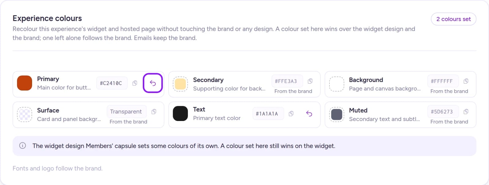
Experience colours override your brand and widget design for a single drop, while logo, fonts, and emails stay on brand.
Preview branded emails
On any experience’s Design tab, the Emails card lets you preview the built-in automated emails that drop sends—styled with your logo and brand colors. These system emails are read-only here. To see every message customers receive during a drop, read What your customers see; to customize your sender name, reply-to, and domain, see Sender identity and sending domain.On Shopify
The Brand editor and Experience colours card work the same way in the Fanfare app on Shopify. Configure your widget colors, fonts, and wording in Design Studio rather than the Shopify theme editor so every drop on your storefront stays consistent. If you leave your brand fonts unset, the embedded widget automatically inherits your Shopify theme’s font. See Storefront setup.Troubleshooting
The status badge shows Save failed
The status badge shows Save failed
Your last edit wasn’t saved, so customers still see the previous settings. This also happens when you select Cancel on a publish-freeze prompt. Fanfare doesn’t retry failed saves automatically—the next edit you make saves all current color and font values in the panel (if a logo upload failed, upload it again). Wait for All changes saved before leaving the page.
A brand color change isn't showing on one experience
A brand color change isn't showing on one experience
A closer layer is overriding that color—check Experience colours on the experience’s Design tab (which also flags widget design overrides), then check Where it’s used in the Brand editor for hosted-page overrides. On hosted pages, page-level style fields inherit only your brand’s Primary color; fields set to Template default keep the template’s color.
An unset color looks different across screens
An unset color looks different across screens
Unset brand colors fall back to whatever layer renders them—the Brand editor previews the Kinetic palette, while your default widget design or a page template may use different defaults. Setting the color in your brand replaces the fallback everywhere that follows the brand (without overriding colors set explicitly on a widget design, experience, or hosted page).
My brand fonts appear in the widget, but not on the rest of my hosted page
My brand fonts appear in the widget, but not on the rest of my hosted page
Hosted pages apply your brand fonts only to the embedded entry widget (unless overridden on the page); the page’s own headings and body copy use its template’s fonts. On your own website, load the fonts on your site or configure the widget to load them—see How fonts work.
Related
Brand, templates, and designs
How design layers prioritize colors and when publishing freezes.
Templates and widget designs
Create reusable page templates, widget designs, and social kits.
Build and publish the hosted page
Customize a hosted drop page’s colors, content, and blocks.
Run it on your own site
Embed and style the entry widget on your own website.