

Available on Growth and above. Wallet pass designs require Pro. See Plans and what they unlock.
Before you start
- Configure your brand first—every template and widget design inherits your logo, colors, and fonts. See Set your brand.
Browse your library
Open Design Studio to see your brand card followed by six sections: Pages, Widgets, Emails, SMS, Wallet passes, and Social. Your saved designs appear as cards alongside Starters from Fanfare (or Kits from Fanfare under Social; Wallet passes starts from a default template). Each design card displays:- Live or Draft status (only Live designs can be selected on experiences).
- Default when set as your organization’s default for that section.
- Usage count on active page templates and widget designs (for example, “Used by 3 experiences”).
- Last edited time, or “Based on [name]” for cloned designs.
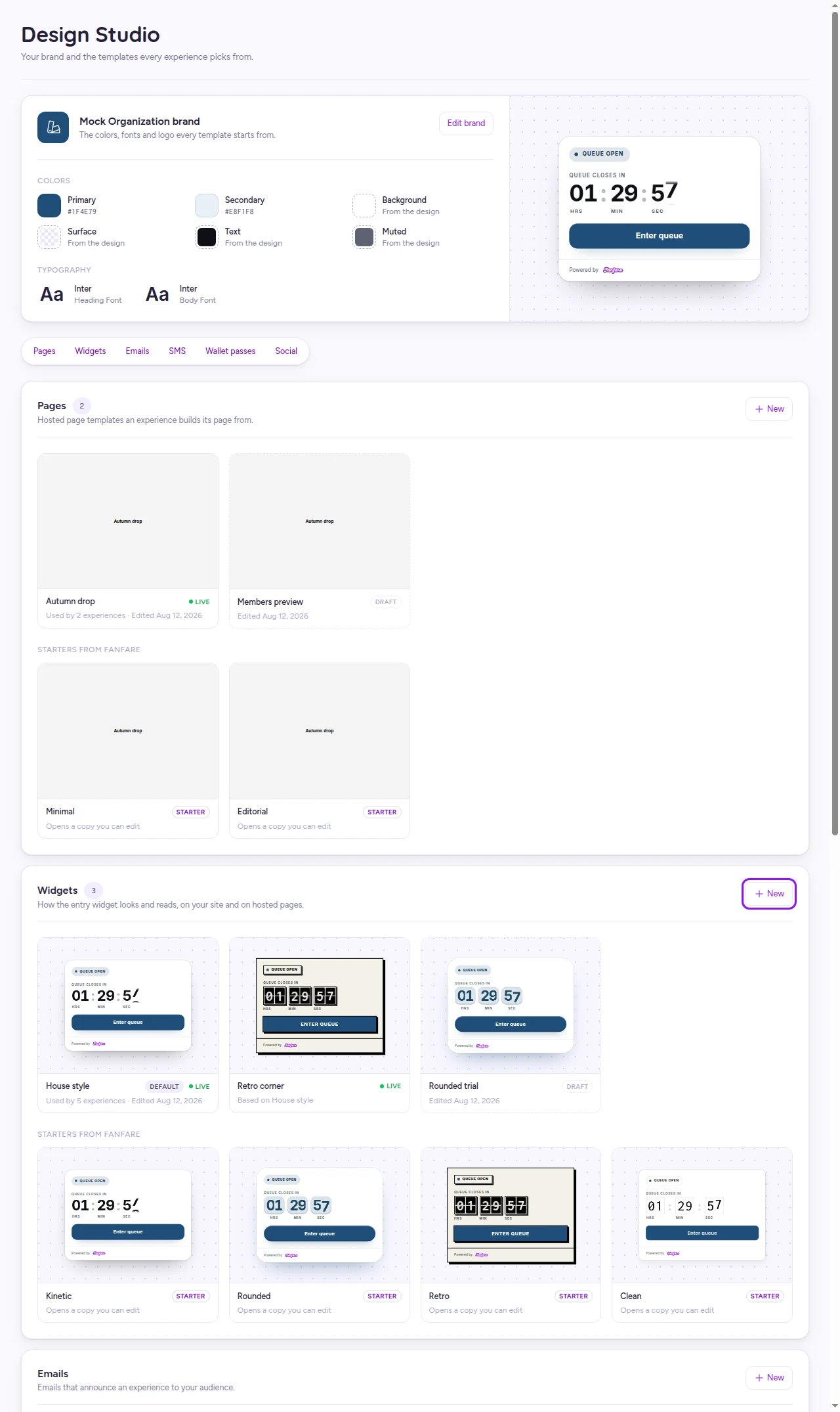
Your Design Studio library organizes reusable designs by where customers see them.
Create a design
Page template
- Under Pages, select New → Experience page and pick a starter—or select any card in Starters from Fanfare.
- Your copy opens in the editor as a Draft named after the starter.
Widget design
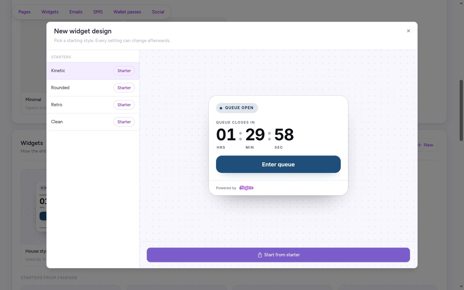
- Under Widgets, select New to open New widget design.
- Pick a starting style: Kinetic, Rounded, Retro, or Clean.
- Select Start from starter to open your new Draft in the editor.
Social kit
Under Social, select Customise on any kit under Kits from Fanfare. Your copy opens as a Draft where you can configure the Card colour (solid colors only), Phase label, Title typeface, message, and hashtags. Edits to a live social kit apply only to posts created afterward. Select your kit when scheduling posts in Announcements.Customize a widget design
Use the canvas’s state picker to preview every stage of a drop, and switch the language menu to preview localized copy.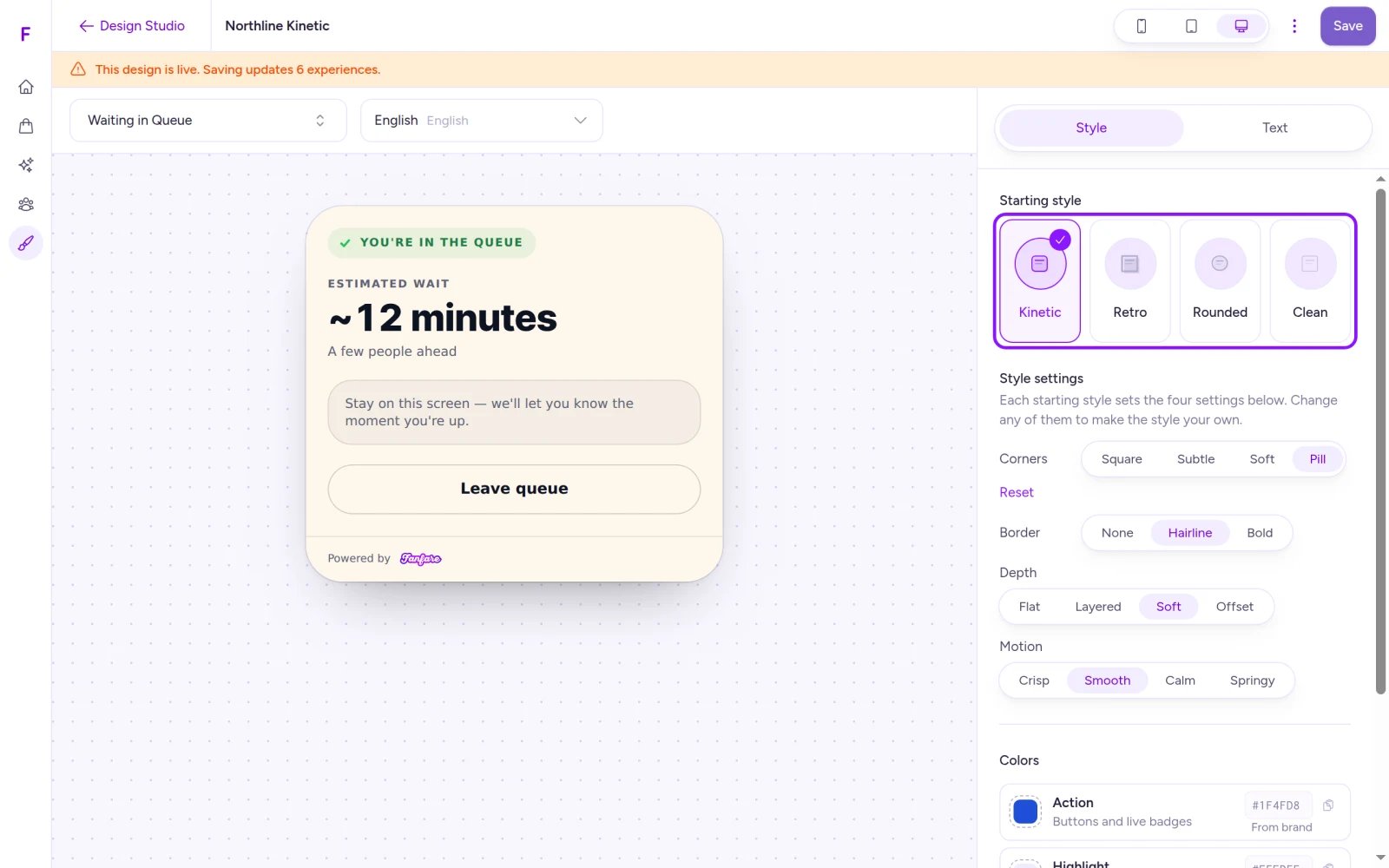
Start from a preset style, then fine-tune corners, borders, depth, motion, and colors with a live preview.
Style tab
Select Reset beside any customized style setting to return it to the starting style. Fonts and your logo always come from your brand, and any color overridden on an experience’s Design tab takes precedence over widget design colors.
Text tab
Customize the widget’s wording in any supported language: English, Spanish, French, German, Italian, Portuguese, Japanese, or Chinese.- Use Search all text to find a label and edit it (up to 500 characters per string).
- Select Reset to default to restore Fanfare’s wording.
- Each language is edited independently, so update every language your customers use.
- Marketing SMS consent copy is fixed for compliance and can’t be edited.
- Remove any unsupported placeholder variables before saving.
Customize a page template
Page templates use the same editor as individual hosted pages—see Build and publish the hosted page for tabs, fields, blocks, and Save as organization template. The preview reflects your last saved version. You can save a template with required fields left blank; individual drop pages must fill them in before publishing.Save and publish a design
Select Save (or pressCmd+S / Ctrl+S). Drafts save right away; saving a Live design asks you to confirm first.
Only Live designs appear in experience pickers (up to 50 per type, plus your default and any design already assigned to the experience). To publish a Draft:
- Save any pending edits.
- Select Publish in the editor toolbar to review what’s going live.
- Confirm with Publish.
Set an organization default
Your default page template is copied whenever you select Create Page on an experience. Your default widget design applies automatically to every experience unless you assign another. Social kits don’t use a default.- Open a Live design.
- Select More actions → Make default.
- For a widget design, confirm Make this the default widget design?—the dialog shows how many experiences follow the default and how many are in a publish freeze.
Assign a widget design to one experience
- Go to Experiences, open the experience, and select Design.
- On the Widget card, select Change design.
- In Choose a widget design, select a published design and click Use template.
…) → Reset to org default to follow your organization default again.
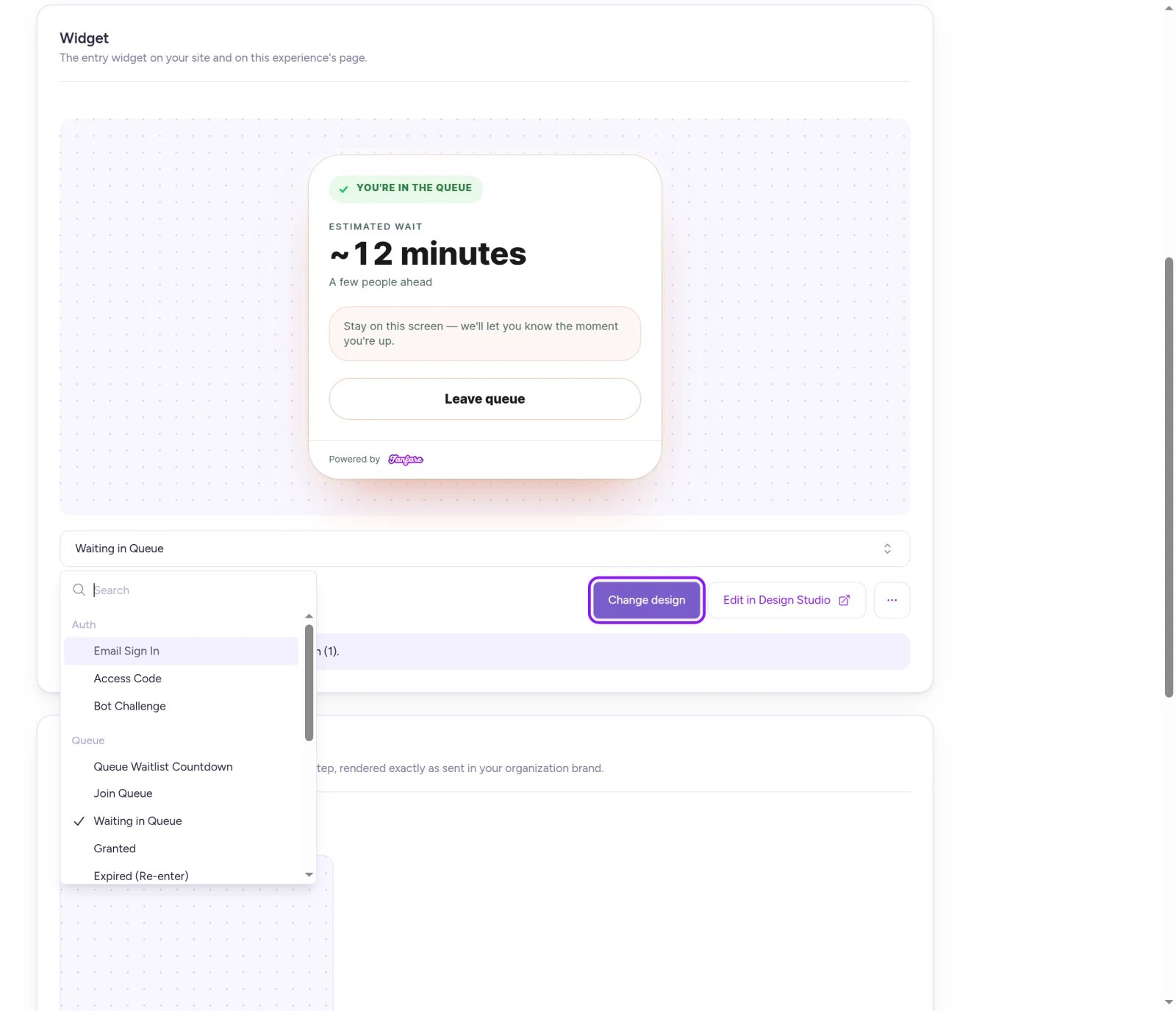
Experiences follow your organization default widget design until you assign a specific design.
Rename, clone, unpublish, and delete
Open More actions inside any design editor to manage its lifecycle:- Clone: Creates a Draft copy with the same name and opens it—rename it right away so it’s easy to distinguish in your library.
- Unpublish: Returns a Live design to Draft and hides it from experience pickers. Existing hosted pages created from a page template aren’t affected; unpublishing a wallet pass design rebuilds passes that used it.
- Delete: Permanently removes the design from Design Studio and pickers. Existing pages or experiences using it keep their current styling.
- Clear the default first: You must select Clear default before unpublishing or deleting a default design.
- Detach widget designs: Reassign any experience using a widget design before unpublishing or deleting it.
- Detach wallet pass designs: Reassign any loyalty audience using a wallet pass design in your loyalty settings before unpublishing or deleting it. See Run a loyalty program.
Emails and SMS templates
Announcements sent from an experience’s Marketing Hub use Fanfare’s built-in announcement layouts rather than Email or SMS templates created in Design Studio. See Announcements.Wallet pass designs
Design how your loyalty pass looks in Apple Wallet and Google Wallet (available on Pro and above). For setting up the loyalty program itself and enabling passes, see Run a loyalty program.1
Create a pass design
Under Wallet passes, select New → Wallet pass. A Draft opens prefilled with Fanfare’s default layout.
2
Customize Apple and Google passes
Select any area directly on the side-by-side Apple Wallet and Google Wallet previews, or pick a section from the Regions list:
- Shared: Program name, Points & tier fields, and the barcode (select the barcode on either pass to edit).
- Apple Wallet only: Colors, Logo text, and Strip image.
- Google Wallet only: Background color, Circle logo, and Hero image.
3
Save and publish
Select Save, then Publish.
Wallet pass field limits
Saving edits to a Live pass design prompts Save changes to a published design?—confirm with Save & rebuild [count] passes.
If you move from Pro to Growth, existing wallet pass designs stay visible so you can Unpublish, Delete, or Clear default, while creating, editing, and publishing require Pro.
Things to know before you go live
- Clearing your organization’s default widget design immediately switches every experience following the default back to Fanfare’s built-in Kinetic style—including live drops.
On Shopify
Everything in Design Studio works the same in the Fanfare app on Shopify, with one note for test emails: sending a test email from a Design Studio editor delivers to your Shopify staff account’s email address, which must be verified in Shopify first.Troubleshooting
Make default is disabled
Make default is disabled
Only Live designs can be set as your organization default—select Publish first. Setting a default wallet pass design also requires the Pro plan.
I can't unpublish or delete a design
I can't unpublish or delete a design
If the button is disabled, the design is currently your default—select Clear default first. If Fanfare blocks the action, an experience or loyalty audience still references it. Check your experiences’ Widget cards (or loyalty pass settings for wallet passes), reassign them, and try again. See Rename, clone, unpublish, and delete.
Publish is disabled
Publish is disabled
Save your pending edits first with Save, then select Publish. For social kits, hover over Publish to check for any validation issues that need to be resolved.
My design doesn't appear in an experience's picker
My design doesn't appear in an experience's picker
Pickers only list Live designs (up to 50 per type). Open the design in Design Studio and publish it so it appears.
The page template preview is blank
The page template preview is blank
Page template previews render using sample data from an existing experience. Create at least one experience to see the live preview—you can still edit and save the template in the meantime.
Related
Brand, templates, and designs
How linked and copied design layers work during a drop.
Set your brand
Configure your logo, colors, and fonts across all templates.
Build and publish the hosted page
Create and publish a drop’s hosted page from a template.
Run it on your own site
Embed your styled entry widget on your own website.
Announcements
Schedule email, SMS, and social announcements using your kits.
Run a loyalty program
Configure loyalty tiers and assign wallet pass designs.